A Compilation of Data Visualization Compilations:
There are a wide variety of tools out there for data visualization. Some nice people have come up with compilations of their favorite tools. Other people have created galleries of really outstanding data visualizations that you can use as inspiration. Over the past year, I’ve bookmarked a lot of them. This post is a curated compilation of compilations. If you’re interested in learning about data visualization on the web, this post might save you some time digging around the internet. Alternatively, it might be a massive time sink.
Catalog of Data Visualization Types:
Dataviz Catalogue
This is a great site for thinking about, or discussing with others, the various advantages and disadvantages of different data visualization styles. Not sure what data visualization style to use for a dataset that is hierarchal? This site might help you put things into a conceptual framework and make a decision.
Three Compilations of Data Visualization Tools:
Data Visualization
A fairly extensive compilation of data visualization tools:
Visualizing Data
Another extensive compilation of data visualization tools. It is definitely worth a visit. Between this one and the one above, there isn’t much not covered.
10-open-source-projects-every-javascript-geo-dev-should-know-about
This post on the ESRI blog is worth a look over, especially if you have map data locked into ESRI applications but want to do things in a more developer-centric and less GUI fashion.
Galleries of Data Visualization Examples:
Scientific Visualization Studio
The Scientific Visualization Studio is out of NASA’s Goddard Space Flight Center. They make animated 2D and 3D visualizations. These look amazing on very large screens, especially if you have higher than normal resolution. Download and run locally, rather than using the youtube player, to get the best picture possible.
D3.js Visual Index
There are a lot of data visualization libraries written in the JavaScript language. D3.js is the reigning champion. D3 (or Data Driven Documents) favors configuration over convention. The advantages are that it is very flexible and powerful. The disadvantage is it has more of a learning curve compared to other JavaScript data visualization libraries that favor convention.
Blocks (D3.js)
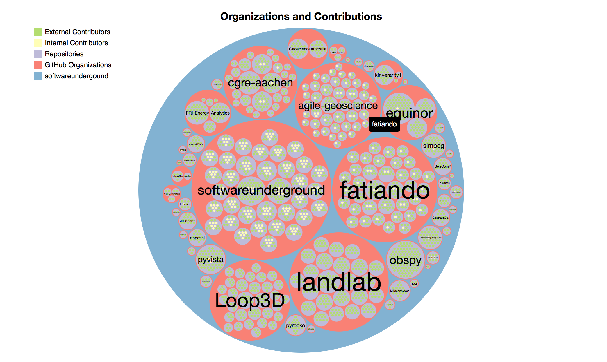
Bl.ocks (pronounced “Blocks”) is a simple viewer for sharing code examples hosted on GitHub Gist. Anyone can use it to easily display their d3 visualizations. If you go to “popular” tab in the upper right corner of the Blocks website, you can see some of the most population visualization on Blocks.
A collection of over 465 data visualizations put together by Marije Rooze, an Amsterdam based front-end developer. Examples largely come from the NYTimes and Guardian newspapers. The ability to filter makes it a good way to find examples.
Stamen
A design studio focused on data visualization and mapping, Stamen produces some amazingly beautiful products for big clients like National Geographic. Definitely check them out if you have a map focus and want to be inspired/humbled.
Road To Larissa
A gallery of data visualizations made by Adam Pearce of Bloomberg Graphics.
SmallMeans
A gallery of favorited NYTimes graphics by a software engineering student.
Data Visualization Blogs:
Flowing Data
I suspect this is one of the most popular data visualization websites. It is the only one I have seen pop-up in my facebook feed several times
Information is Beautiful
Run by David McCandless. This website has data visualization “best of” contests and lots of generally cool data visualizations.
Nicholas Felton (website)
More infographics than data visualizations, a big name worth checking out.
A curated selection put together by Felton. These are pieces of art as much as they are data visualizations.
Personal webpage of Nadieh Bremer who, in her own words, is a Astronomer-turned-Data-Scientist-turned-self-taught-Data-Visualization-Designer. In addition to her own work, which is stunning, she has a well curated list of internet resources and books on data visualization.
Not just pretty pictures, this blog has some excellent writing about what makes for good data visualizations. FILWD is edited byEnrico Bertini, Assistant Professor at the NYU Tandon School of Engineering. He also has a podcast, Data Stories.


0 Comments