Inspiration
Bret Victor is a well known thinker on the future and possibilities of human – computer interface. His website contains a variety of thought provoking projects, and his talks have inspired many other works.
Currently, he’s leading development of Dynamicland, a new way of interacting with and creating computer programs that involves image recognition, paper, and projectors. The best way to understand it is by watching videos of people using it.
In one of his most well known talks “Inventing on Principle” he discusses his principle that “creators need an immediate connection to what they create”. Although it can be interpreted as a call to create completely new ways for interacting with computers, like in Dynamicland, or creating reactive programming interfaces with more immediate feedback, like Nicky Case’s joy.js, we can also read this as an encouragement to look for more incremental improvements that shorten the distance between creator and what they create. I think the incremental version of this concept is illustrative in regards to what open-source side products people might work on in geo-computing.
State of things
I previously worked for nine years in the oil and gas industry. Most oil and gas software is a collection of clicks and drop-down menus. Sometimes the steps users follow are not too different from the original process done with paper and pencil. Although I no longer work with that type of data professionally, I still play with geoscience data via side projects. I leverage open-source libraries and although they are more flexible, I’ve sometimes found myself struggling to quickly try different things, visualize the result, and iterate. Too often I have to re-type code, hit return, repeat and see the result. Additionally, getting geoscience data into open-source software built for other types of data at times feels either hacky or too great a leap. This is especially true in JavaScript where, I would argue, most of the current amazing new things in data visualization tend to occur but few geoscientists venture, as they tend to stay to Python. In all of these cases, the distance between creator and creation is a bit larger than it could be, which makes exploring hypothesis spaces slow. This slowness limits what you can or might end up doing.
How can we shrink the distance between creator and creation in geo-computing?
I often see two ways.
First, we can make it easier to leverage the wide variety of open-source libraries when working with geoscience data, a glue and adapter approach. Too often getting data into the right form is either slow and hacky or simply doesn’t exist. Small tools that solve common problems.
Second, we can make it easier to do many iterations quickly, a widgetization approach. Specifically, iterate more through mouse movements and other inputs that are continuous more and iterate less through discrete inputs like typing, clicking, or recalculating. This makes it faster and more enjoyable to explore a hypothesis space and stumble onto different ways to visualize raw data in aggregate or other form.
Glue & adapters
Working with geoscience data in any open-source library requires getting the data in. This is less of a problem in analytics focused Python libraries like SciPy and Pandas, in part because people have built great tools like SEGYIO (seismic), LASIO (well logs), and WELLY (well logs). Adapters and glue libraries in JavaScript are more lacking. This is understandable as most scientists learn Python, for good reasons, but unfortunate because many of the cool new projects in data visualization are written in JavaScript, as that’s the language of the web. To give an example of the limitations, I can’t find a library for loading and displaying seismic in HTML, CSS, JavaScript that is open-source. This isn’t because it isn’t possible to do. Several companies offer seismic web visualization as part off their cloud services. It is either that no one has made an open-source version, or it isn’t used much so is hard to find.
Wellio.js
As an example of trying to fill this glue and adapter gap for getting well log data to be easily usable in JavaScript data visualization libraries, I’ve started Wellio.js as a side project. Wellio.js is both a front-end and back-end (node.js) JavaScript library. It takes in native well log files in LAS 2.0 format and transforms them to JSON format, which JavaScript libraries can read.
Some libraries and tasks that now become easier include:
-
D3.js
- One of the most popular data visualization libraries, it lets you access lower level control so can make pretty much anything.
-
Vega.js
- Sorta like d3.js but based on a visualization grammar. You trade some power and flexibility for speed and ease of use.
-
Three.js
- Arguably the current standard for quickly making three-dimensional content on the web. You can go in a million directions with it and people do.
-
AR.js
- Augmented reality without an app or headset, just your browser and your regular smart phone.
So what could you do with seismic or well data with the libraries above? With d3.js you can replicate just about any traditional visualization of well log data. G3.js is a partially completed library but still pretty cool library that attempts this. The Wellio.js github page has a demo that uses g3.js. One of the advantages of using JavaScript is all the computation can be done client side. This means you can upload to a web application your own well logs to be visualized or analyzed and no data gets sent to a cloud server, it all stays in your browser. Additionally, you don’t have to install any software or code.
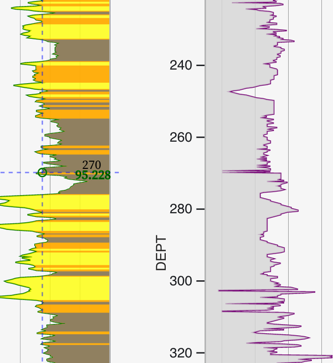
With vega.js, wellio.js, and ObservableHQ you can then quickly & interactively visualize & analyze well curves in the browser and write little bits of code to interactively try new things. Here is an example that plays around with the spearman’s correlation coefficient.

3D well logs in three.js
Once well log data is in JSON, it becomes easy to work with it in three.js to make 3D visualizations as shown in this basic example on Observable that you can edit and change.
AR.js is a library I have some experience with in the augmented reality space. I’ve used it to create an Augmented Reality business card with a 3D depiction of Gale Crater on Mars. AR.js can use three dimensional visualizations created in three.js. As shown above, we can visualize well logs in three.js after converting the well logs LAS 2.0 formatted file into JSON. There is nothing stopping us from having a paper map with symbols on it that bring up augmented reality well logs and surfaces such that we could look at the subsurface in field using only a paper map and the cell phone you already have in your pocket.
Widgetization
How do we make exploring hypothesis spaces faster and easier and less constrained with widgets? I’ll start off by saying I’m not entirely satisfied with any of the solutions out there. The level of immediate feedback depicted in this Bret Victor video with the programmatically drawn tree is hard to get to and still be flexible enough to tackle a different problem quickly. Generally the approaches to these types of problems describe themselves as either a GUI (graphic user interface) library, a widget library, or a reactive computer library or language. GUIs are all about building a graphic user interface for the end-user where code is probably not exposed. Widgets are sliders, buttons, wheels, and other sorts of graphical conventions that users can use to quickly change a variable’s value across a continuous range. Reactive libraries like joy.js attempt to mimic some of the magic depicted in Bret Victor’s talk while flexible enough to allow people to build their own.
Example tools for widgetization:
- ObservableHQ (webpage that executes end-user-typed JavaScript in real time inside notebook like enviornment)
- Jupyter Widgets (widget add-on for Jupyter notebooks)
- Bokeh Widgets (Like Jupyter widgets but for Python Bokeh data visualization library)
- TKinter (Old school but still works GUI builder for Python)
- WXpython (Old school but still works GUI builder for Python)
- Idyll-lang(JavaScript library, for explorable explanations)
- Joy.js (reactive style JavaScript Library, the closest to Bret Victor flower demo)
Two Small Examples
Examples of some experiments I’ve done recently in ObservableHQ with a little widgetization include this quick demo of well logs and a correlation coefficient and this experiment in sonifying well logs.
Example of a widget-ed data visualization I want that doesn’t exist yet:
There’s a widget I’ve been wanting but haven’t built yet. It would be useful for machine-learning predictions of either stratigraphic surfaces or facies. I would like to have a function that creates a new feature from original features along a well bore. All the variables in the function would be draggable widgets like in this joy.js example. There would be immediate linkage between this function and several other visualization on the page, similar to how dc.js works. One would be a typical vertical well curve visualization. The other a scatter plot with points colored by label class. Labels might be facies or at “pick”, “near pick”, and “away from pick”. Lastly, there would be a random forest tree visualized as a tree of links and nodes. I would be able to select all the data downstream of a specific node and use that data in the visualizations. Both the well curve plot and the scatter plot would be brushable, meaning data selected in one visualization is highlighted in the others. I think this type setup, where you can immediately see the effect of different choices in your feature creation function on how labels are clustered could greatly speed up the process of engineering effective features as a replacement for all the different types of observations we make when we look at a log.
And now for something completely different: Alternative Means of User Input?

Another way to make user input and exploration continuous instead of discrete and get real-time feedback, is to change the means of input away from mouse and keyword entirely. This is related to widgetization but maybe another step down the line? In the image above taken at the Cleveland Museum of Art, a user is molding a digital representation of clay with their hands. Could the same technique work for salt bodies in 3D seismic? Clicking takes a lot of time for seismic interpretation and has health and safety implications. Why not drawing? I can draw lines over seismic with a digital pen significantly better than I can with a mouse click hold. Kinect cameras capture 3D surfaces and create digital topography on a small human scale. A popular geoscience education use of Kinect cameras is an augmented reality sandboxes. Can kinect’s be used for input into technical problems too? Additionally eye tracking and body tracking technology that leverage machine-learning is getting good enough to start considering practical use. Are there use-cases where these types of inputs are preferred or could be used in addition to mouse clicking?
Conclusion
I’m not Bret Victor, and you’re probably not either (if you’re actually Bret Victor, hi). Although creating things at his level is inspiring, it is also difficult. Aiming for a little in that direction, however, is perhaps instructive in terms of identifying opportunities to make something cool and even potentially useful.
0 Comments